What a Performance Marketing Dashboard Should Actually Show You
A performance marketing dashboard is supposed to answer one question fast: is the money working, and what should I do next. Too many dashboards answer a different question, which is how many metrics can we fit on one screen. The difference between the two is whether the dashboard actually helps you decide.
Lead with the metrics tied to your goal
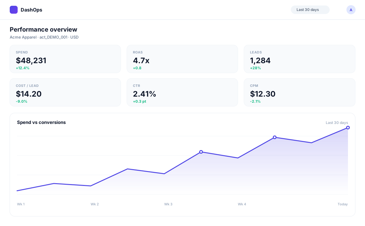
The top of the dashboard should show the few numbers that matter most for your objective, not a wall of everything. For a lead-gen account that is leads and cost per lead. For e-commerce it is purchases and return on ad spend. For awareness it is reach and frequency.
Putting the goal metric first means anyone can glance at the dashboard and know how things are going in a second. Everything else is there to explain that headline, not compete with it.
Show change, not just totals
A spend figure on its own does not tell you much. The same figure next to last period, with the direction and the percentage change, tells you a story. Period-over-period comparison is what turns a dashboard from a status board into a decision tool.
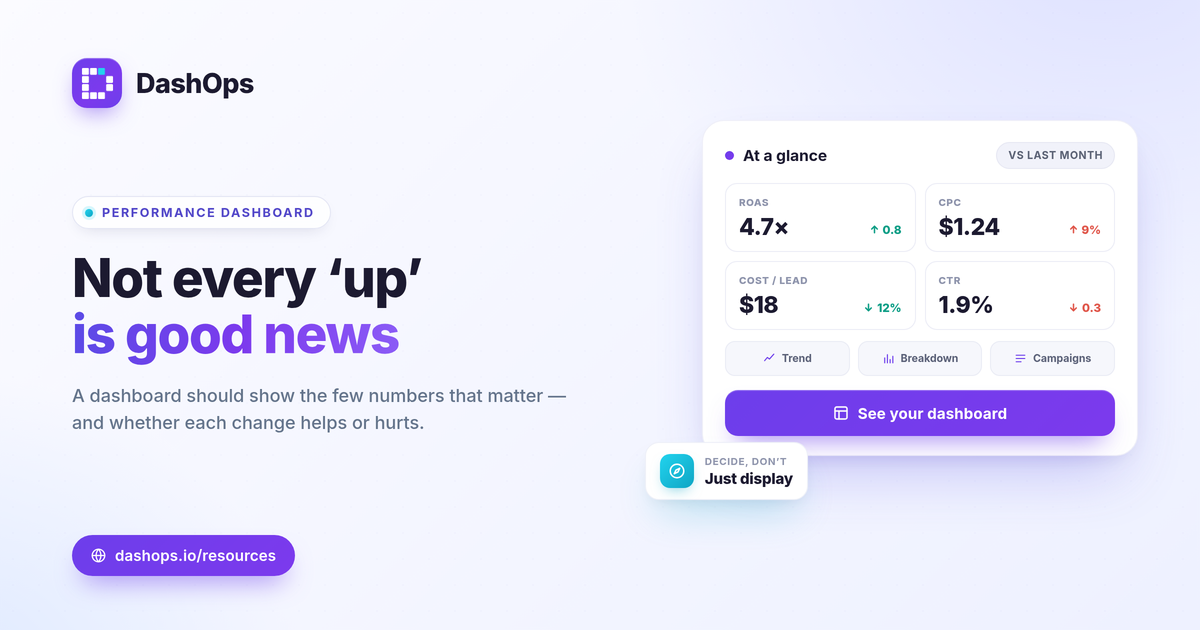
The best dashboards make the change impossible to miss, with clear up and down indicators colored by whether the move is good or bad for that specific metric. A rising cost per click is red, a rising return on ad spend is green.
Make it easy to find the why
When the headline moves, you need to find the cause without leaving the page. That means a few supporting views close at hand.
- A trend chart, so you can see when the change started.
- A breakdown by demographics and placement, so you can see where it is coming from.
- A top campaigns view, so you can see which ones are driving the number.
If finding the cause means exporting data into a spreadsheet, the dashboard is not doing its job.
Leave the noise off
A good dashboard is defined as much by what it leaves off as what it shows. Vanity metrics that do not change a decision, and granular numbers that belong in a drill-down, should not crowd the main view. If a metric never changes what you do, it does not belong on the front page.
How DashOps approaches it
The DashOps dashboard leads with the KPIs that match each account’s objective, shows period-over-period change with direction-aware indicators, and keeps the supporting views, trend charts, demographic and placement breakdowns, top campaigns, and spend pacing, one glance away. It spans every connected ad account, so you are not rebuilding the picture per account.
If you want to decide which numbers belong on your own dashboard, start with our guide to the Meta Ads KPIs that matter, and see the pricing page for what each plan includes. A dashboard should save you time and sharpen your decisions. If it just displays data, it is a report, not a dashboard.
Frequently asked questions
What is a performance marketing dashboard?
How many metrics should a dashboard show?
Should a dashboard show comparisons?
See it in your own dashboard
DashOps brings Meta Ads reporting, campaign management, and white-label client portals into one place. Pick the plan that fits how you run ads.